
B2B Portal
Dealerportal
Dormakaba
Overview
Dormakaba's Movable Walls division ran two separate dealer portals: Skyfold for the US, Modernfold for international markets with more complex project management. Both were non-responsive, visually outdated, and internally inconsistent.
I owned the UX end-to-end: discovery, information architecture, flows, wireframes, and patterns. UI execution was handled by a colleague at Design Group Italia, in close collaboration with my UX deliverables.
9 core flows redesigned: portfolio, search, navigation, quote forms, homepage, project management, document resources, account management, and login.
Role
Sole UX Designer
Period
December 2024 — April 2025
Tools
Figma · FigJam · Lookback · Claude
The Starting Point
“Horrendous.”
The client's own description of their two legacy dealer portals. Non-responsive. No feedback on user actions. Navigation inconsistent across pages. Forms embedded with no visual coherence.
— Dormakaba stakeholder, kick-off meeting
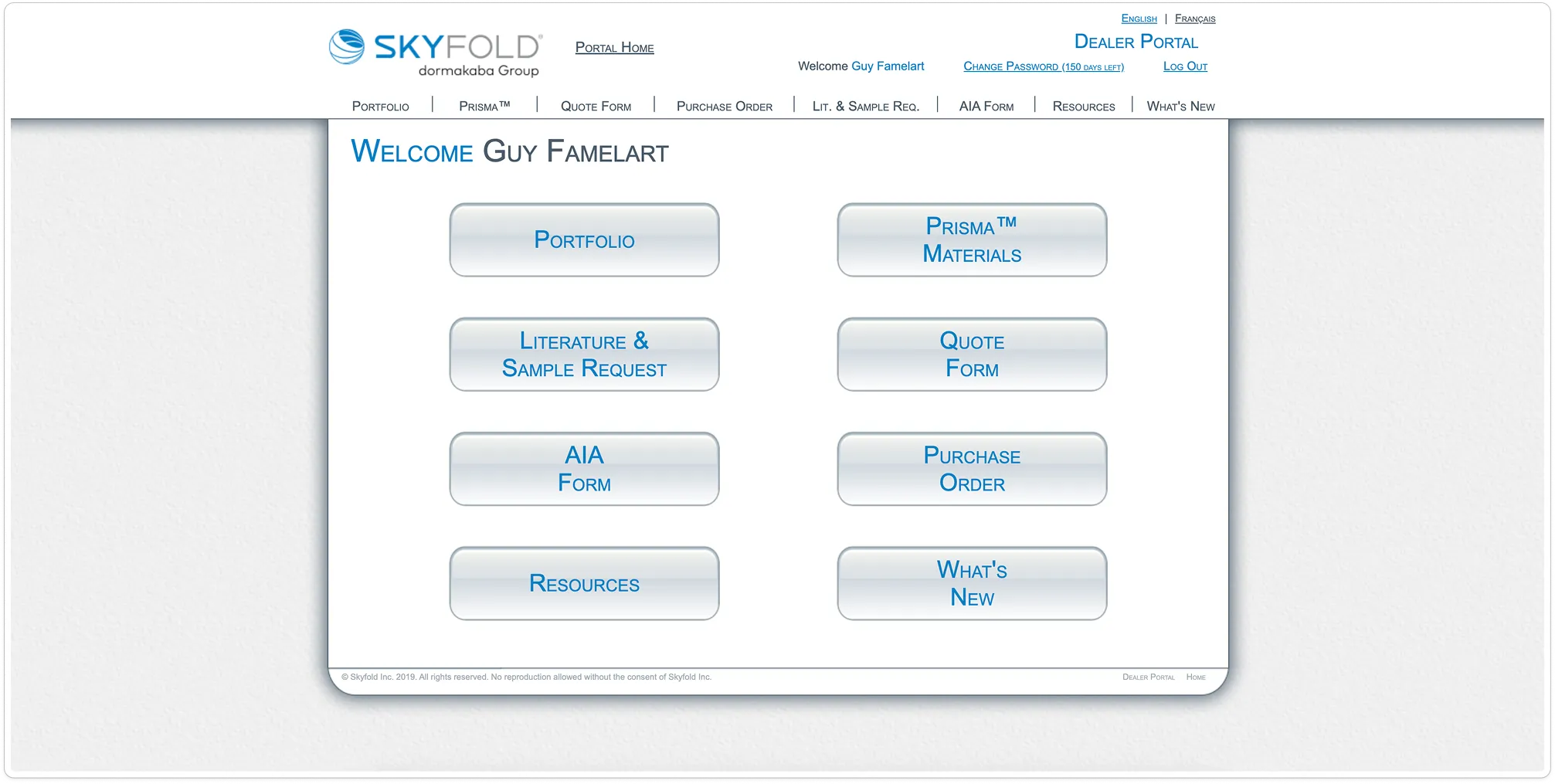
Skyfold: legacy dealer portal
Sequential Delivery
Shared patterns. Brand-specific flows.
01
Discovery & IA
02
Core Flows
03
Management
04
Finalization
Information Architecture
Unified sitemap accommodating both portals' feature sets within a single navigation model.
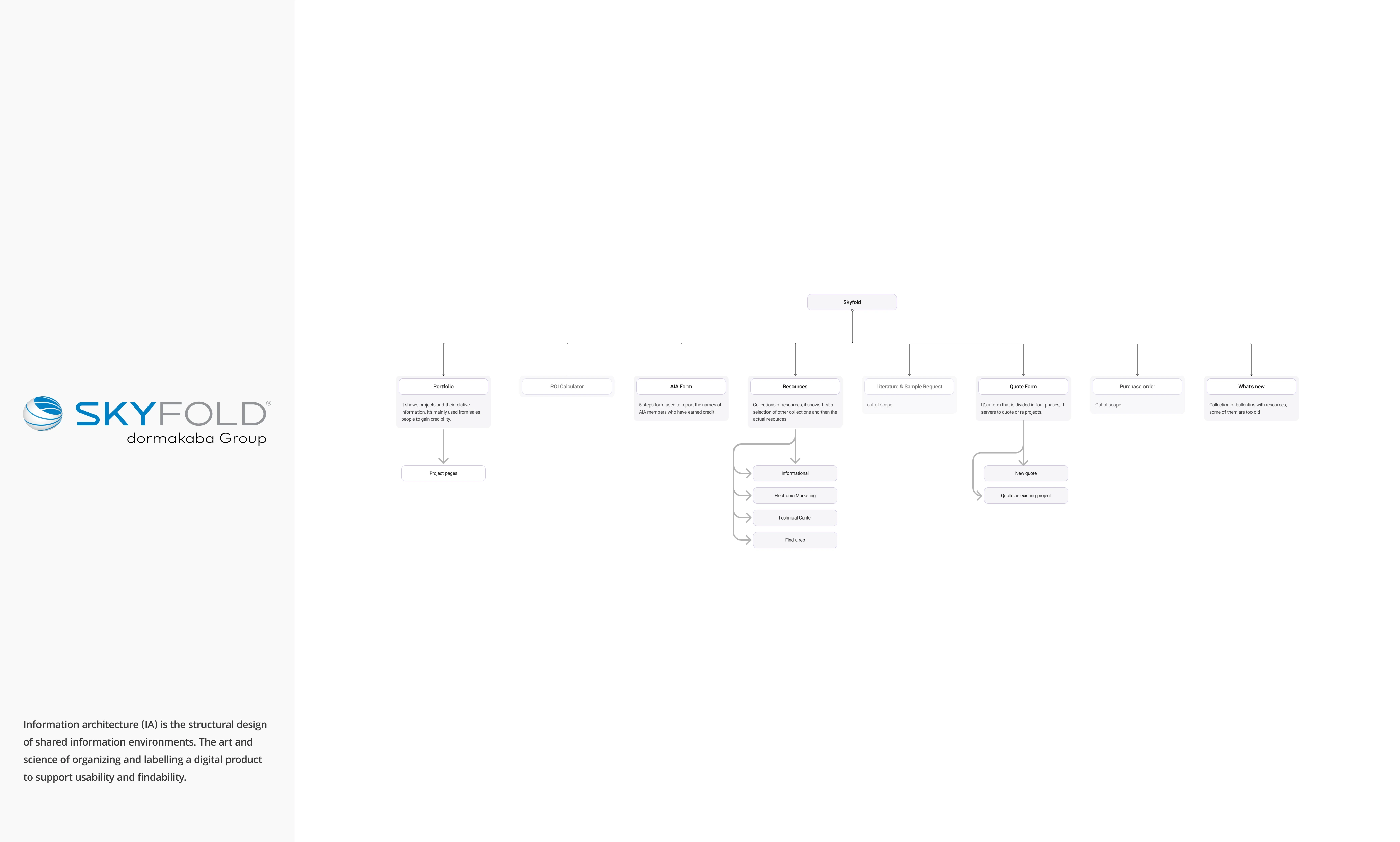
Skyfold: Sitemap & Flow Diagram
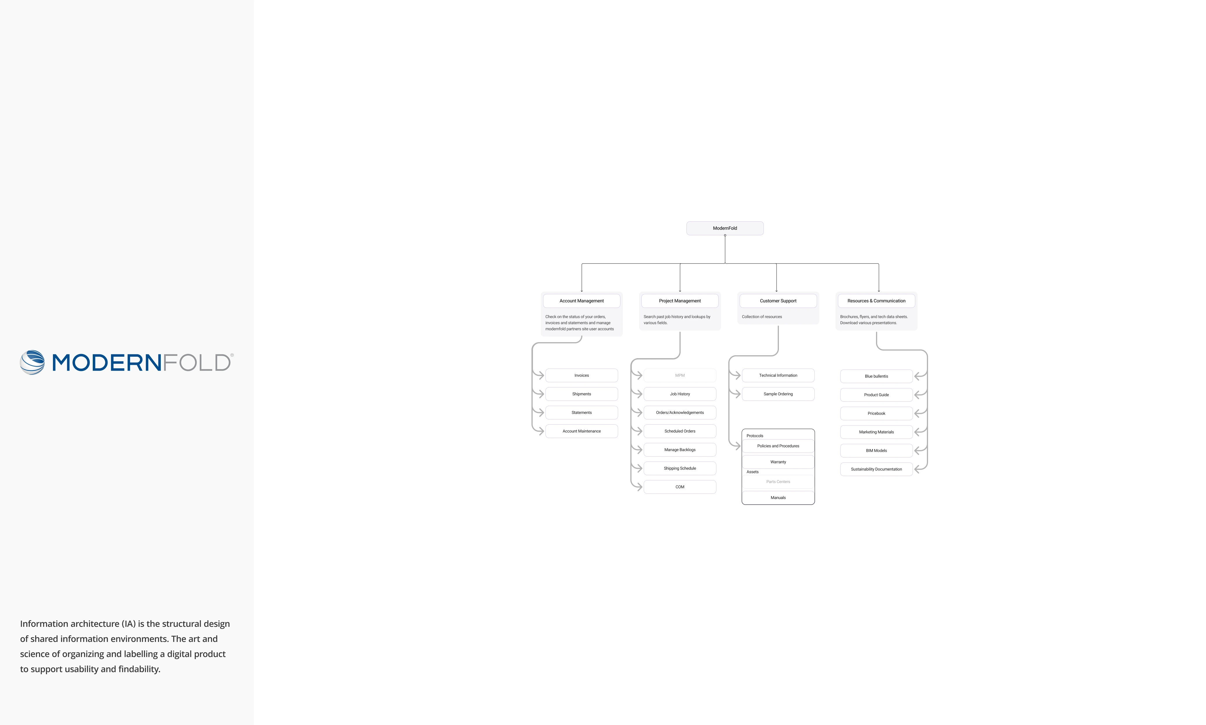
Modernfold: Sitemap & Flow Diagram
Wireframe → Final
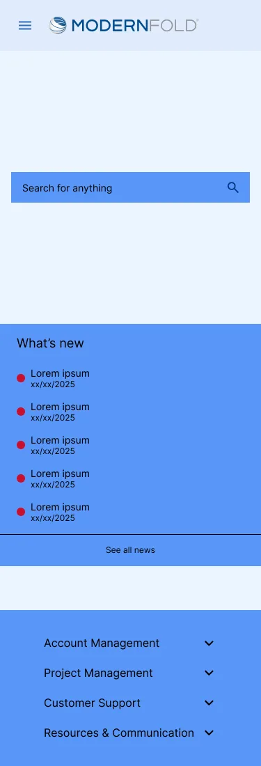
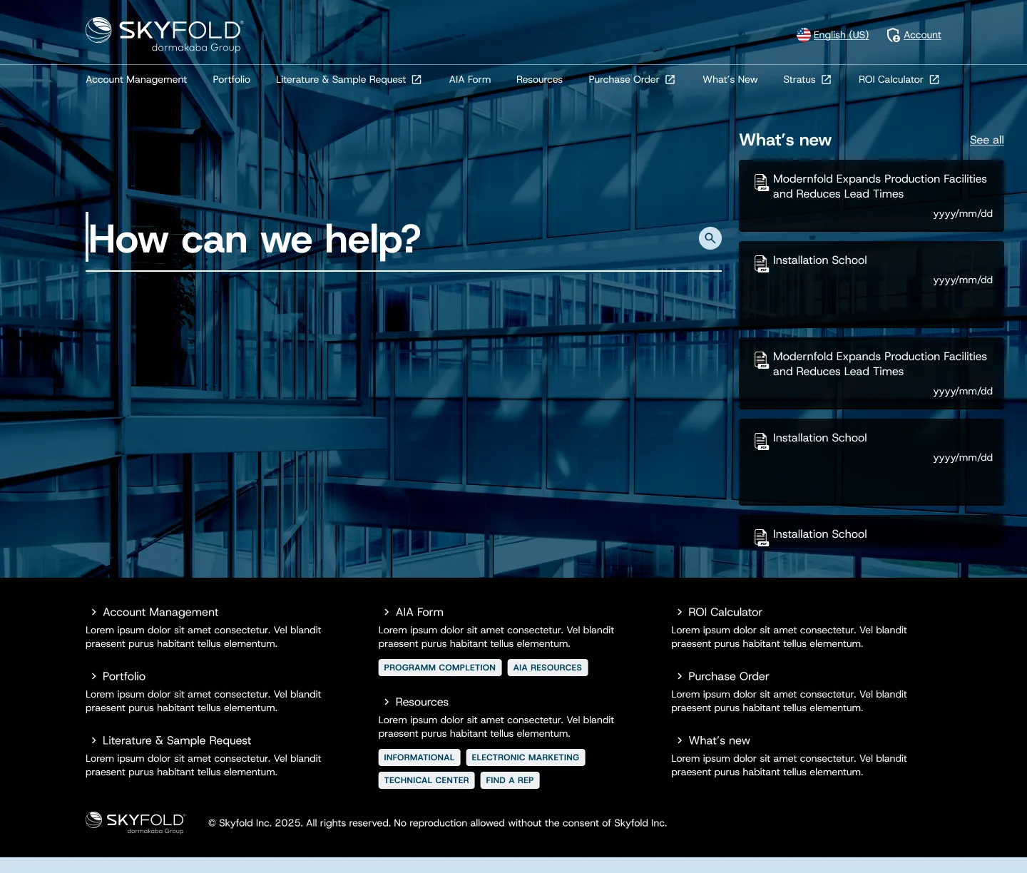
01/Homepage
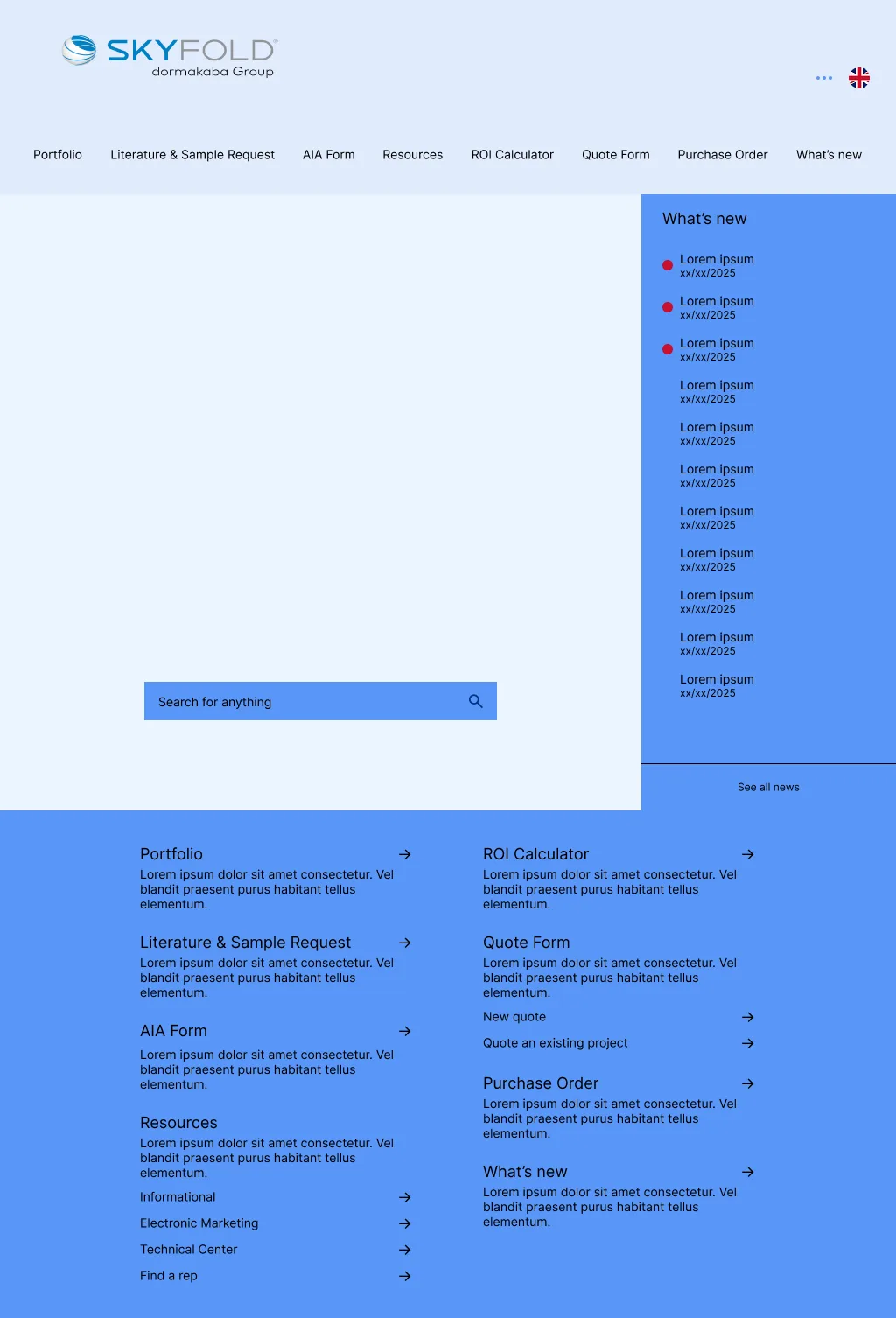
Skyfold: Homepage Wireframe
Skyfold: Homepage Wireframe (Mobile)
Skyfold: Homepage Final
Skyfold: Homepage Final (Mobile)
02/Orders
Modernfold: Resources Wireframe

Modernfold: Resources Wireframe (Mobile)
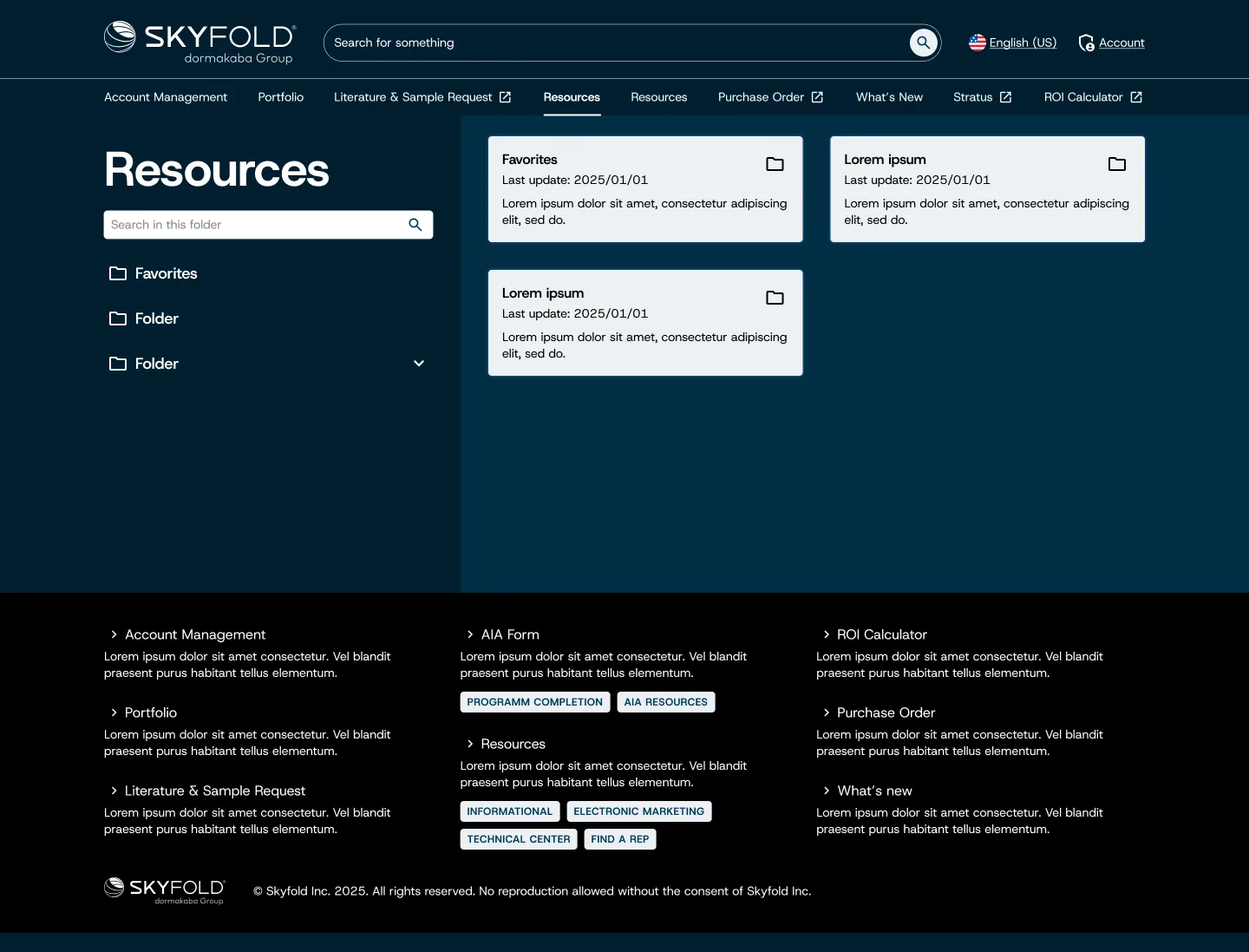
Modernfold: Resources Final
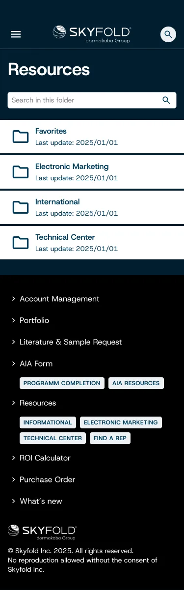
Modernfold: Resources Final (Mobile)
03/AIA Form
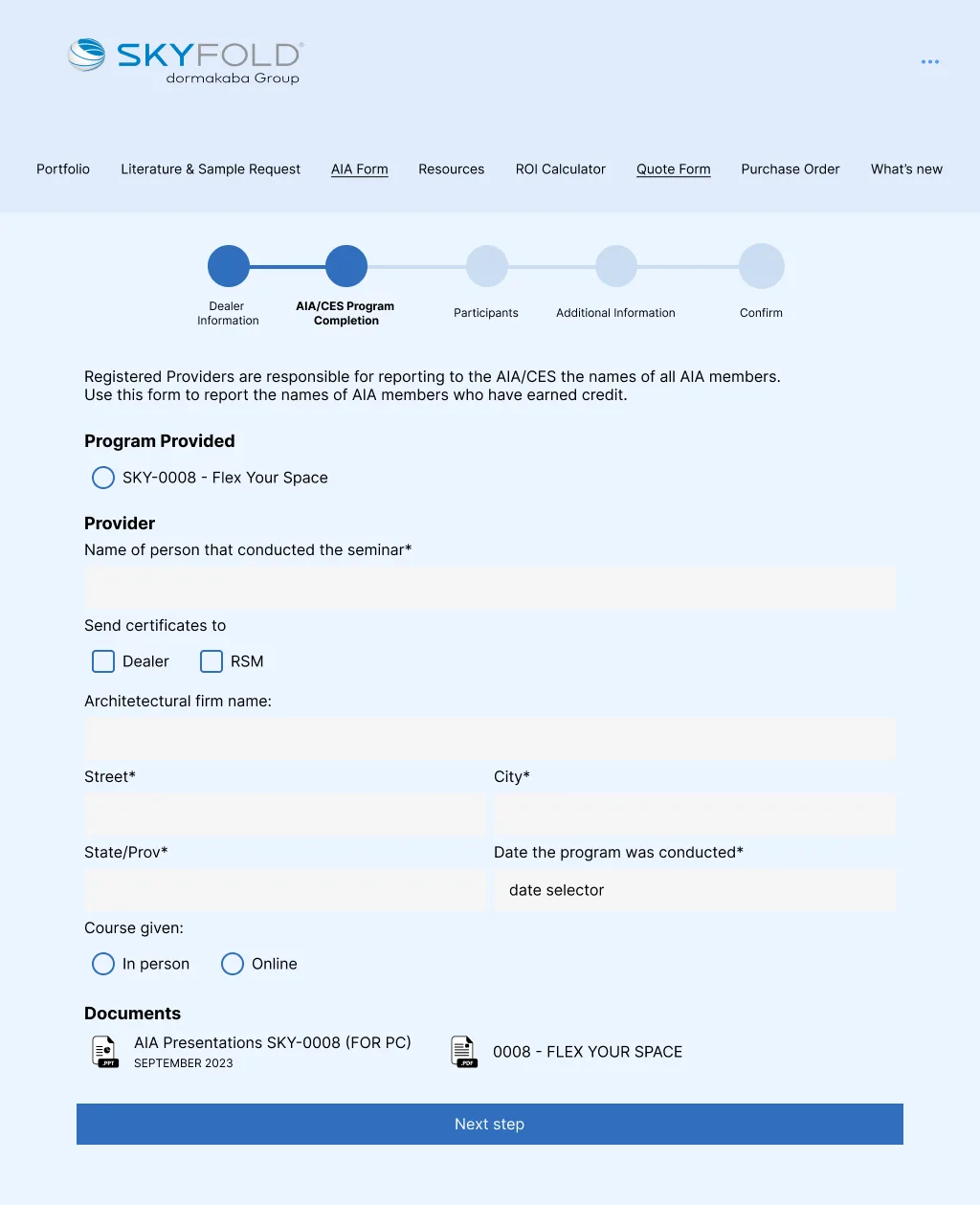
Skyfold: AIA Form Wireframe
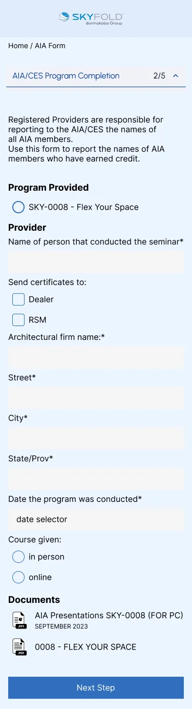
Skyfold: AIA Form Wireframe (Mobile)
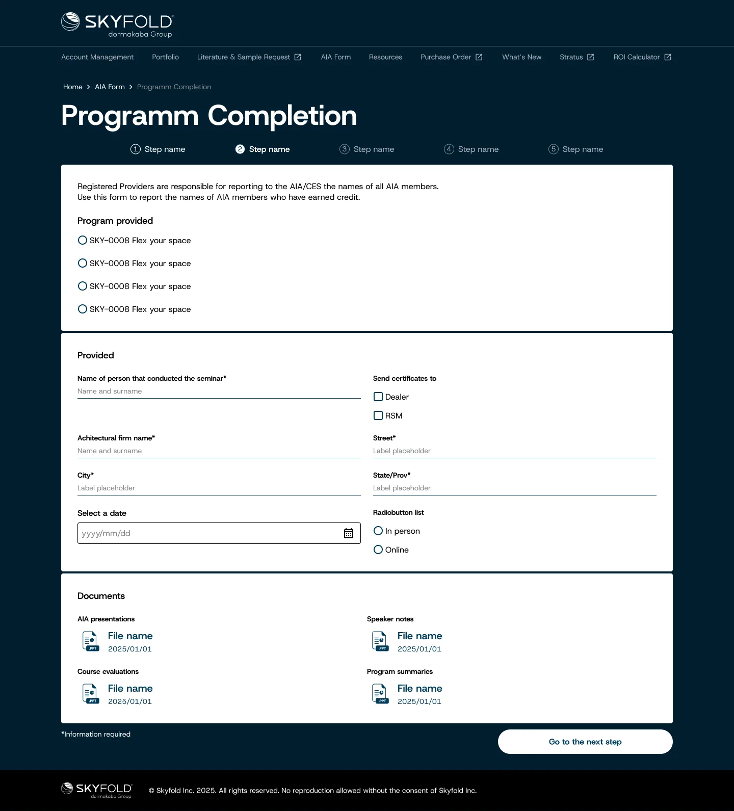
Skyfold: AIA Form Final
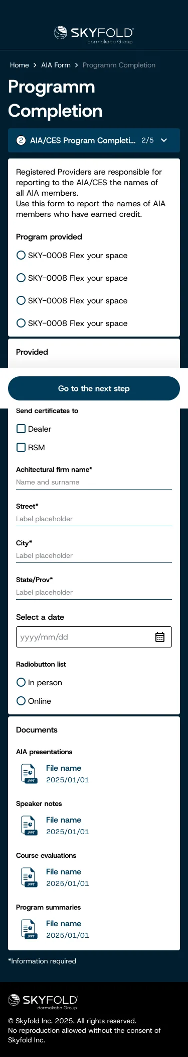
Skyfold: AIA Form Final (Mobile)
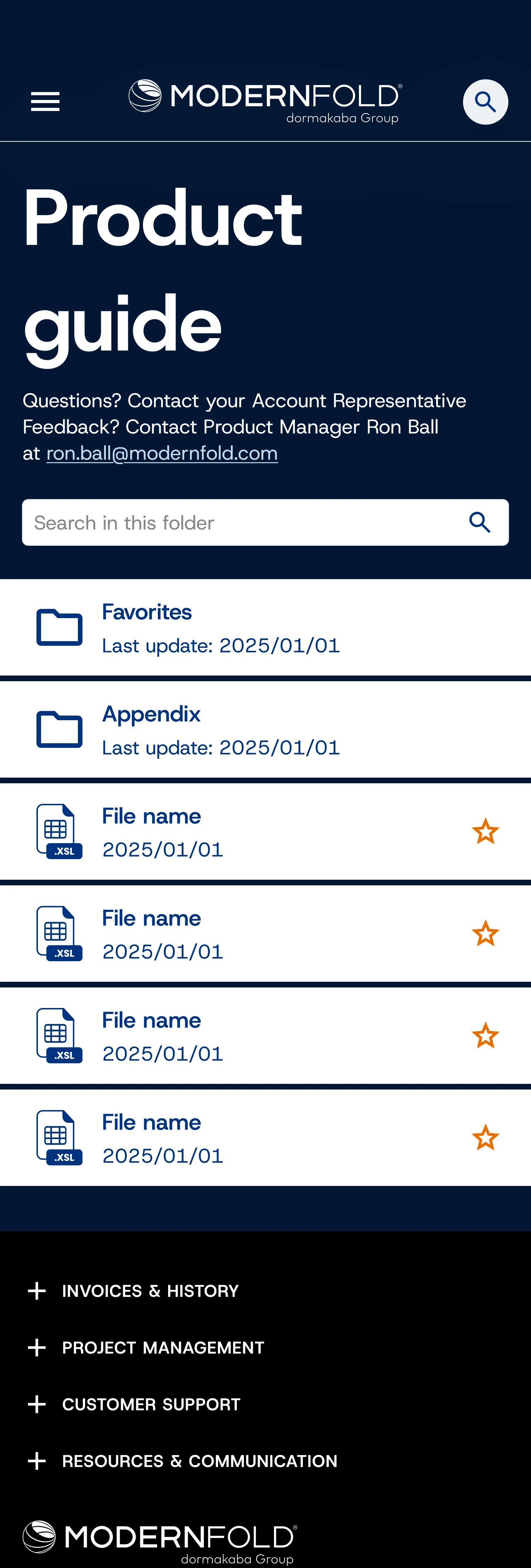
04/Document Management
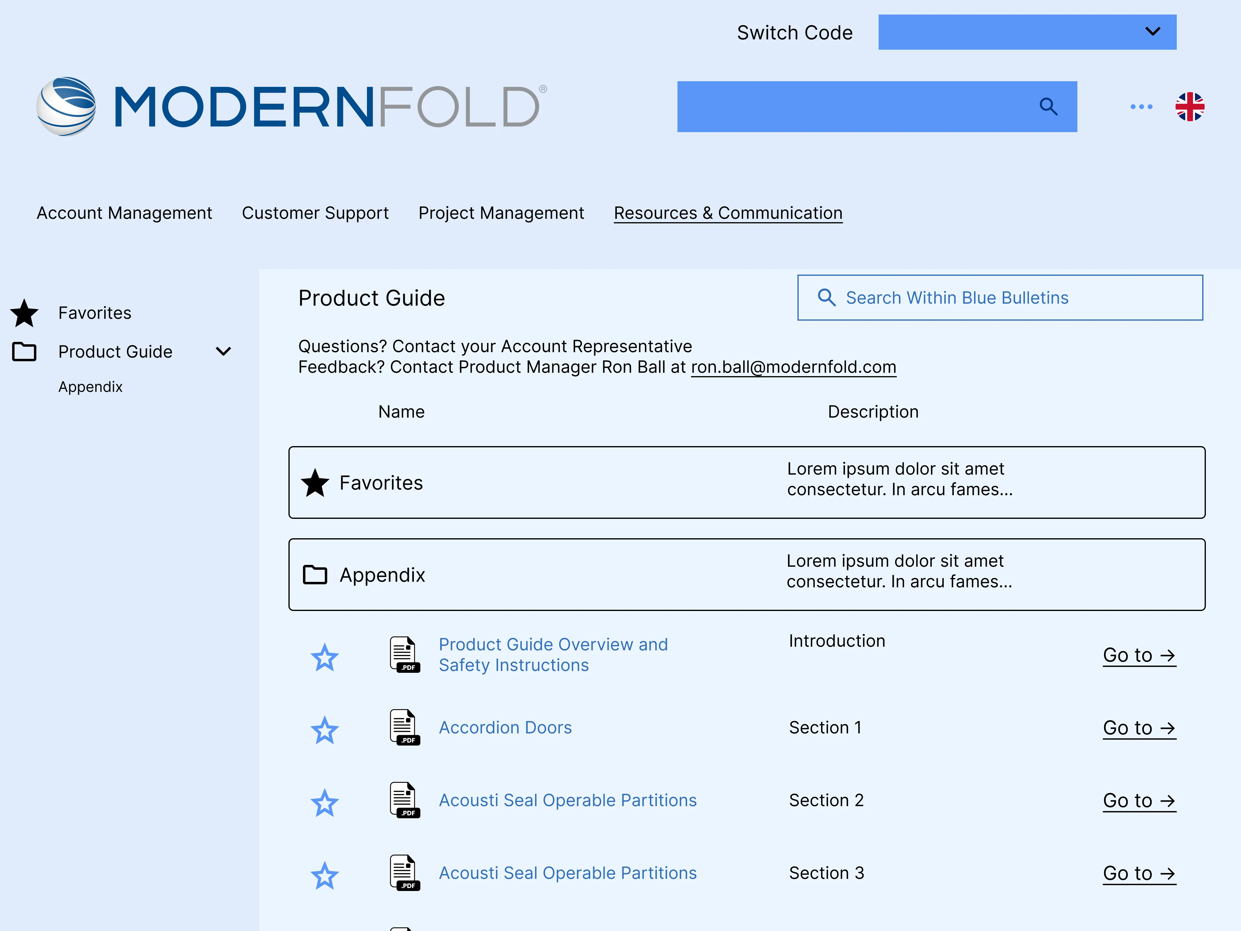
Modernfold: Product Guide Wireframe
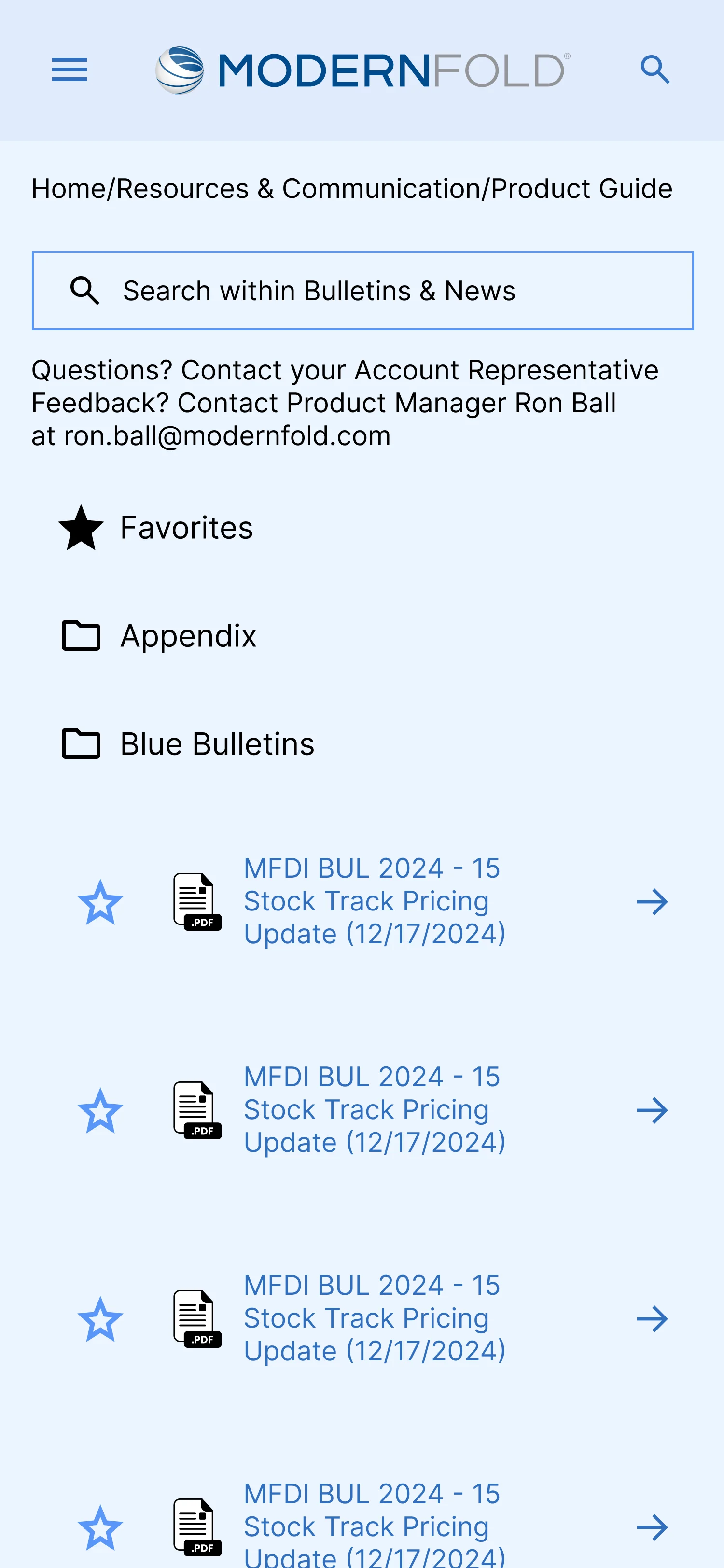
Modernfold: Product Guide Wireframe (Mobile)
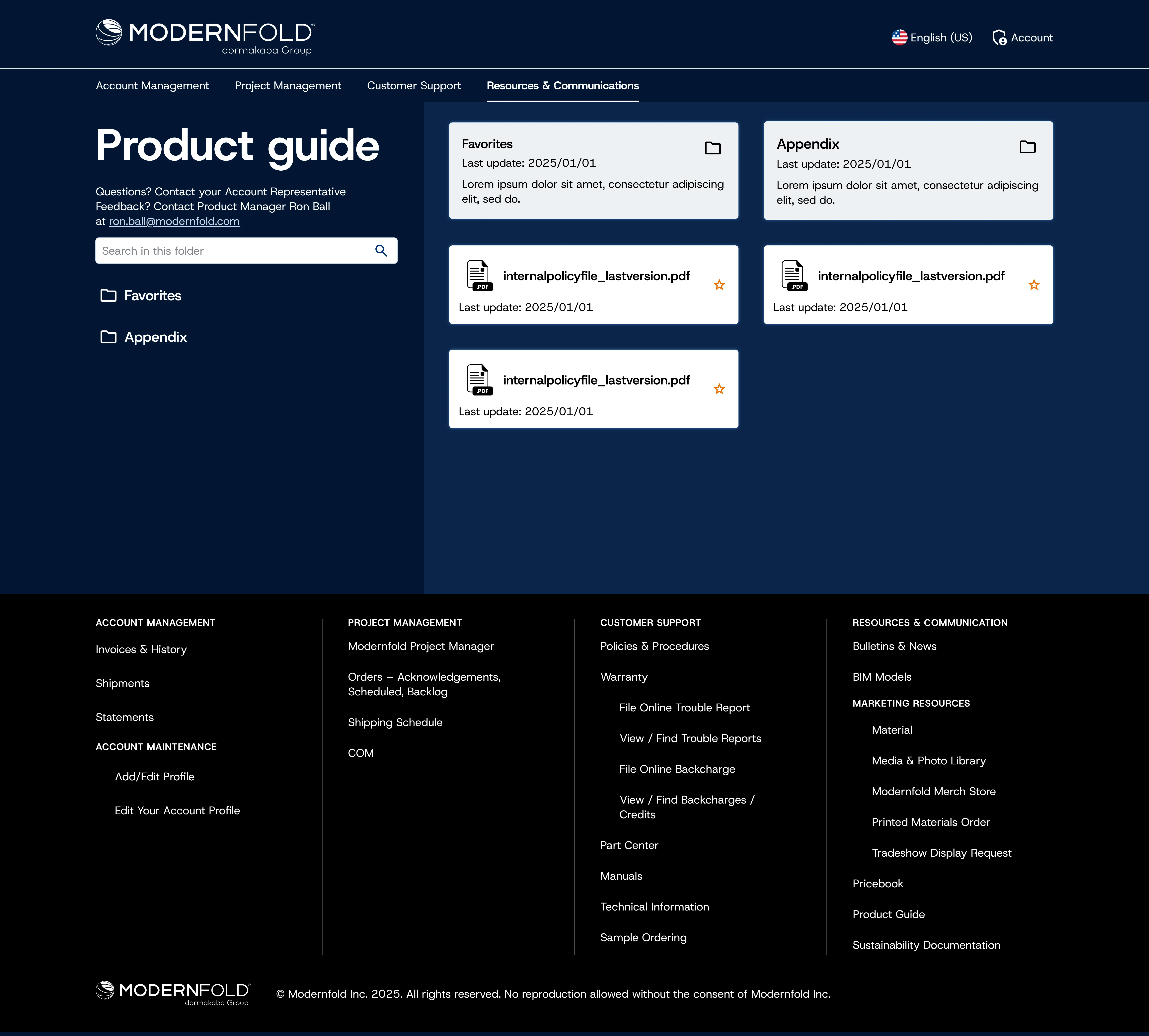
Modernfold: Product Guide Final
Modernfold: Product Guide Final (Mobile)
Key Decisions
Unified architecture, modular functionality.
The temptation on a unification project is to force everything into one product. I went the opposite direction: unified UX architecture, same patterns, same navigation logic, with a modular structure where brand-specific sections follow shared rules without being forced into a single flow. Dormakaba can now add, remove, or swap sections without redesigning the system.
Zero learning curve on something familiar.
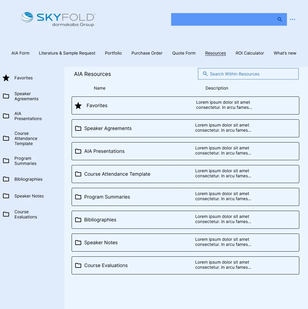
Both portals had chaotic document management: files nested dozens of levels deep, others buried in dropdowns. I adopted the file-management pattern dealers already use every day outside the portal: flat folder structure, preview, breadcrumbs, search. These are construction professionals who need to pull a spec sheet fast. Zero learning curve on something they've been using for years.
Designed for users who don't care about design.
The users of these portals are construction industry professionals: architects, contractors, installers. They don't evaluate interfaces, they execute tasks. I kept the UX decisions boring on purpose: familiar patterns over novel ones, short paths over elegant ones, screens built to be scanned, not admired. The best compliment this kind of design can get is that no one notices it.
Approach
Ran discovery workshops with internal product owners and dealer representatives to surface pain points, priority use cases, and technical constraints, establishing a shared understanding before any design work began.
Designed a unified information architecture that accommodated both portals' feature sets within a single navigation model, reducing cognitive load for dealers managing multiple product lines.
For document management, evaluated the original interfaces and ruled out incremental improvements. Adopted Google Drive as the reference model: flat folder structure, preview, breadcrumb navigation, search. Zero learning curve for dealers who already knew the pattern.
Outcomes
Rolled out across both portals and now live with Dormakaba's dealer network across the US and international markets.
Reflection
The thing I carry forward from this project is that on enterprise B2B, the design is never just about the screens. It's about making decisions that hold up when features are added, when requirements evolve,
when the same pattern has to work across two products with different constraints.
Most of the time, that means choosing the boring option over the clever one.
Next project