
AI Platform / Energy Design
Dark Mode Ads
Plenitude
Overview
80% of the world's population lives under light-polluted skies. Digital billboards are among the worst offenders. Up to 10× brighter than surrounding light sources.
I designed the entire platform end-to-end: public landing page, AI generation tool, admin panel.
Delivered in under two months as sole designer.
The platform launched at Cannes Lions 2026. Testing confirmed up to 74% energy saving:
a single 2×3m LED billboard running Dark Mode saves up to 246 kWh in one week.
Role
Sole UX/UI Designer
Period
Jan–Mar 2026
Tools
Figma · Framer · Claude
Final Result
The interface itself became the product demo. Dark backgrounds, green gradients, subtle glow. The UI doesn't just contain Dark Mode Ads, it performs it.
The Generation Model
One input. Two intentional levels.
Not two random alternatives. Two levels of how far the AI is allowed to go.
Minimal changes. Maximum brand fidelity. Dims the image, preserves every element.
Balanced intervention. Rebalances contrast and palette while staying on-brand.
The Product
Visit live platform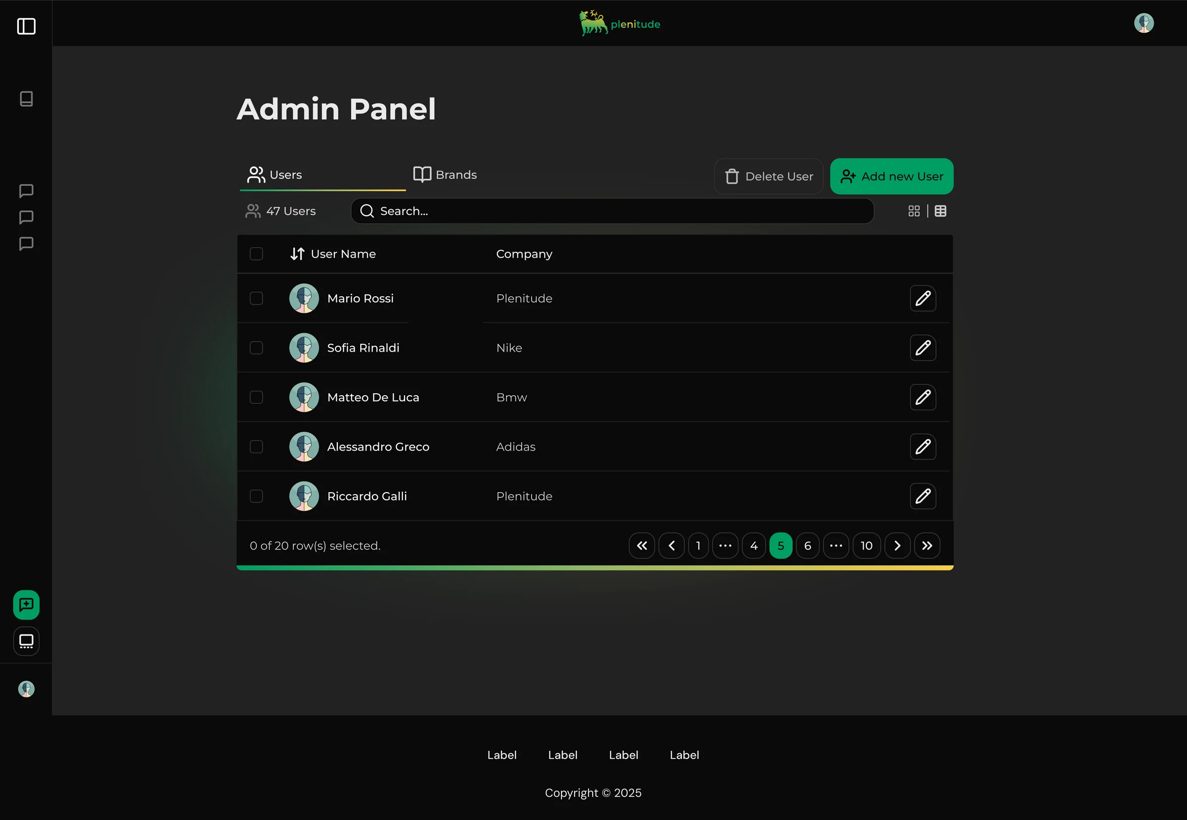
Admin Panel: User management
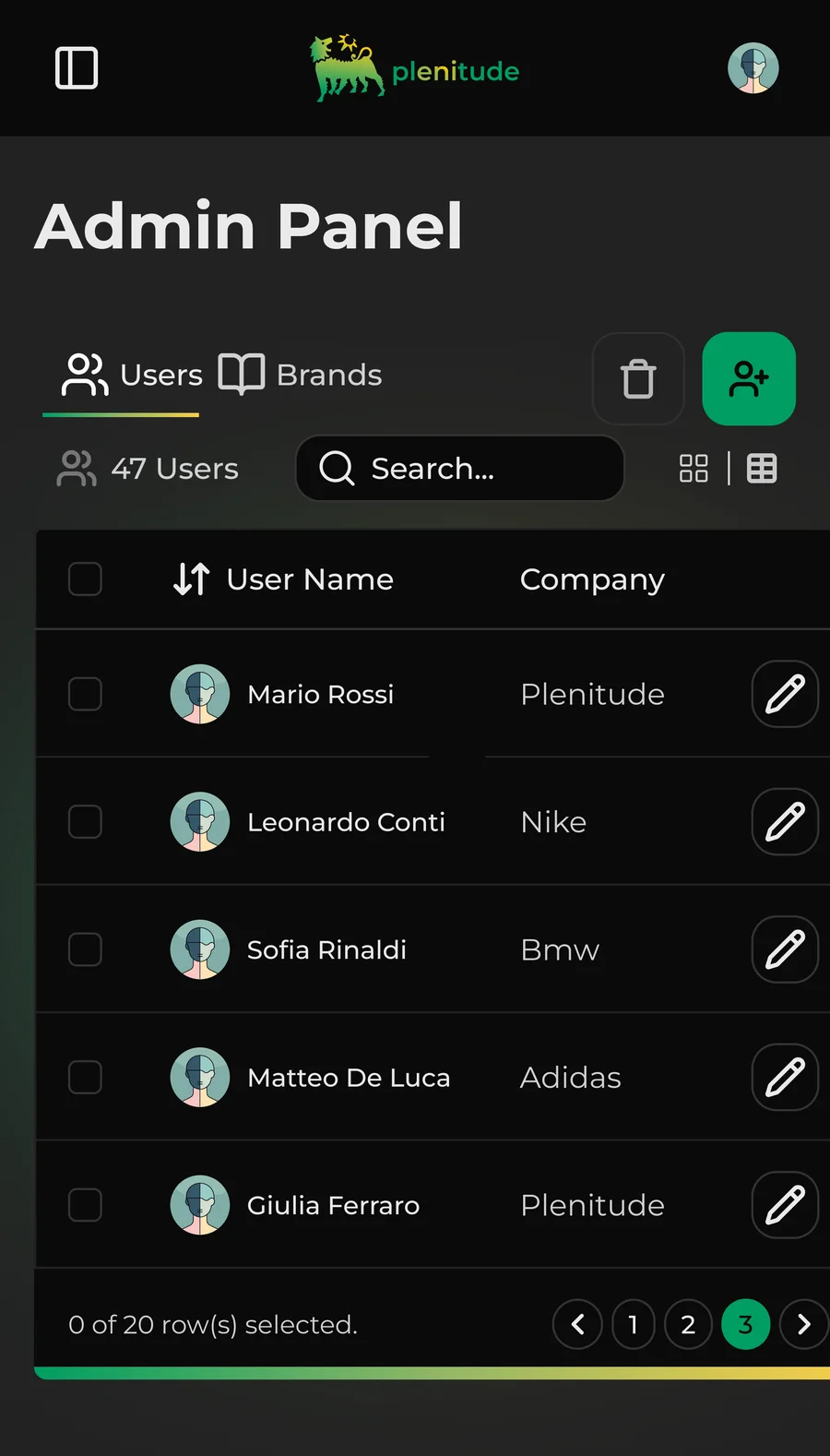
Admin Panel: User management
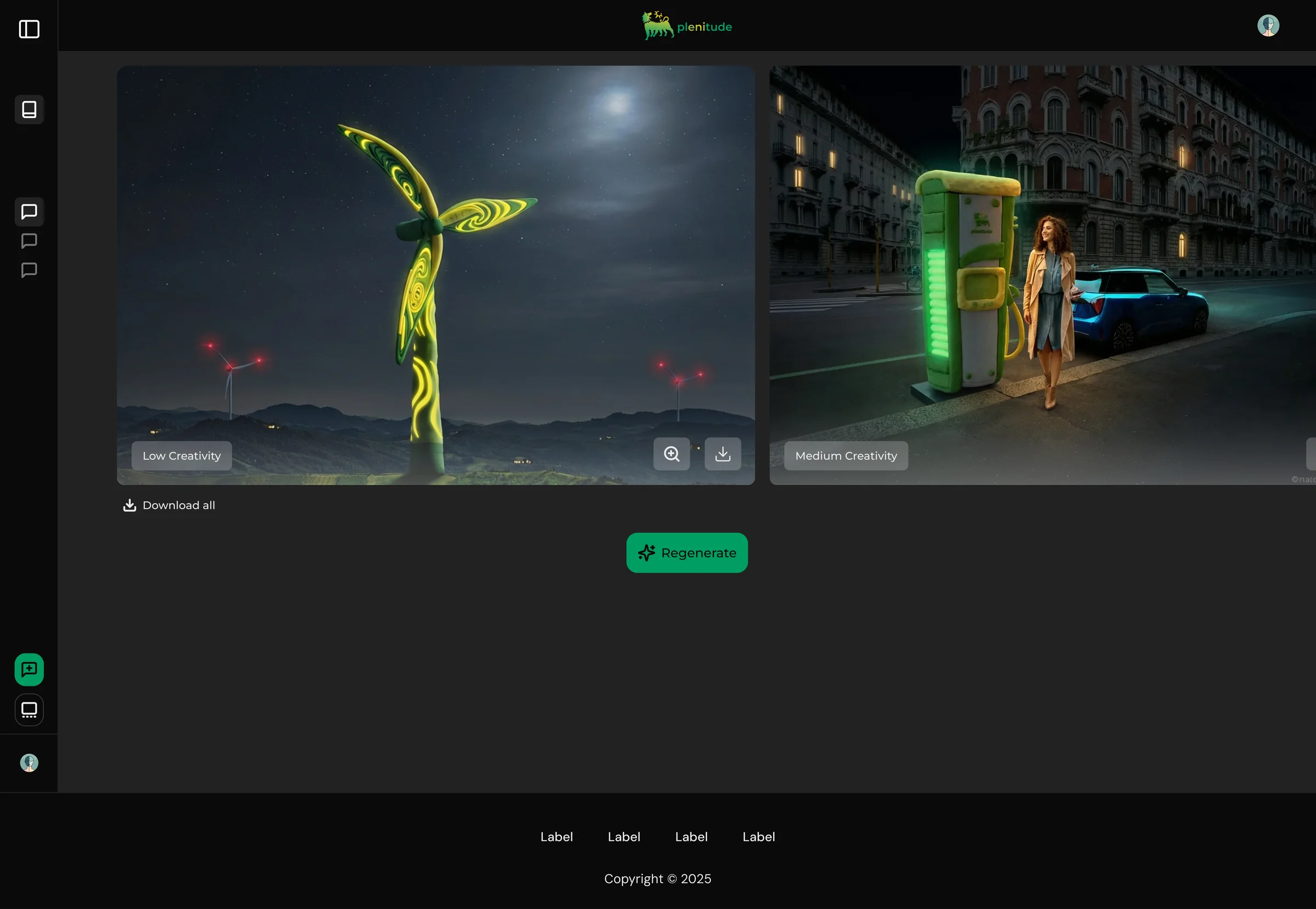
Generation Interface: Results
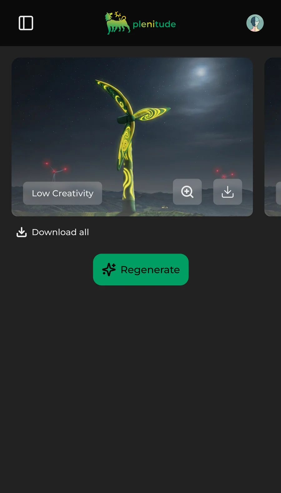
Generation Interface: Results
Key Decisions
The interface should argue for the product, not just contain it.
The first UI iteration was light mode: yellow-green backgrounds, clean but generic. It looked like a SaaS tool that could have been anything. The pivot to dark wasn't cosmetic: the product is called Dark Mode Ads, it exists to reduce light at night. The UI became a demonstration of what the platform does. Dark backgrounds, green gradients, subtle glow effects. When you open the tool, you're already experiencing the philosophy behind it. The landing also ships with a light mode (activated by clicking the logo in the header), proving the system adapts rather than being locked into one aesthetic.
Multi-brand architecture from day zero.
Phase 1 was Plenitude only, but the roadmap included expansion to other brands. The easy choice would have been to design for one brand and figure out multi-brand later. I chose the opposite. The admin panel was built with brand management from the start: adding brands, assigning users to specific brands, configuring brand settings. Designing for one brand and redesigning for five later would have meant rethinking navigation, permissions, and the entire visual layer. Doing it on day one meant adding a few components.
Approach
Mapped the full lifecycle of a billboard campaign, from agency submission to production handoff, to identify where AI-generated night variants could slot in with minimal friction.
Pushed for a dark interface that would embody the concept, not just wrap it. The UI itself became a demonstration of what the platform does: dark backgrounds, green gradients, subtle glow effects.
Designed the generation UX as deliberately simple: upload, generate two variants at increasing levels of AI intervention (Essential / Adapted), approve. No manual sliders.
Built the admin panel with multi-brand architecture from day zero: brand management, user-to-brand assignment, brand settings. Expansion to new brands required no redesign.
Outcomes
Presented at Festival de Cannes 2026 and currently live.
darkmodeads.com/Reflection
The biggest thing I carry forward from this project is that an interface should argue for the product, not just contain it.
The pivot from light to dark wasn't a cosmetic preference.
It was the moment the UI started doing conceptual work.
Next project